Introduction to ggpubr package
If you are a researcher who wants to have publication-ready plots but does not want to get hassled by the ggplot2 package, then let me introduce you to theggpubr package. Using this package you can make publication grade plots without spending too much time modifying things. Even if you are a beginner in R programming and does not know how to use theggplot2 package, you will still be able to plot graphs using the ggpubr package because of how easy the syntax is. But having prior knowledge of the ggplot2 package will surely make things easier, and an experienced person will know that any plot which can be plotted using ggpubr can also be plotted using ggplot2. So let us start.
First things first, install the ggpubr package and load it in the library.
install.packages("ggpubr")
library(ggpubr)
We will first see what all plots can be plotted.
Plots in ggpubr package
1. Balloon plot
The balloon plot is similar to bar plots as it is used to represent a large categorical dataset. The size and colour of the dot can be attributed to different values in the dataset.
# library(viridis) for colour palette
ggballoonplot(mtcars, fill = "value") +
  scale_fill_viridis(option = "turbo")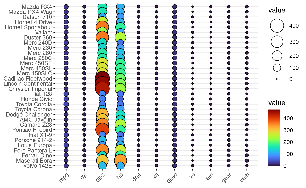
2. Bar plot
A simple bar graph which is used for representing categorical data. By using the add function inside the main plot function, you can easily display summary statistics like mean, median etc. and various types of errors like standard error, standard deviation and various others. You can view the whole list of features here.
# install.packages("palmerpenguins")
# library(palmerpenguins)
ggbarplot(penguins,
          x = "species",
          y = "bill_length_mm",
          add = c("mean_sd"),
          fill = "species",
          label = TRUE,
          lab.nb.digits = 2,
          lab.vjust = -2.2,
          lab.col = "red",
          title = "Mean bill length of penguins",
          subtitle = "Error bars shows standard deviation",
          xlab = "Species of penguins",
          ylab = "Bill length (mm)",
          ylim = c(0,60),
          palette = "npg")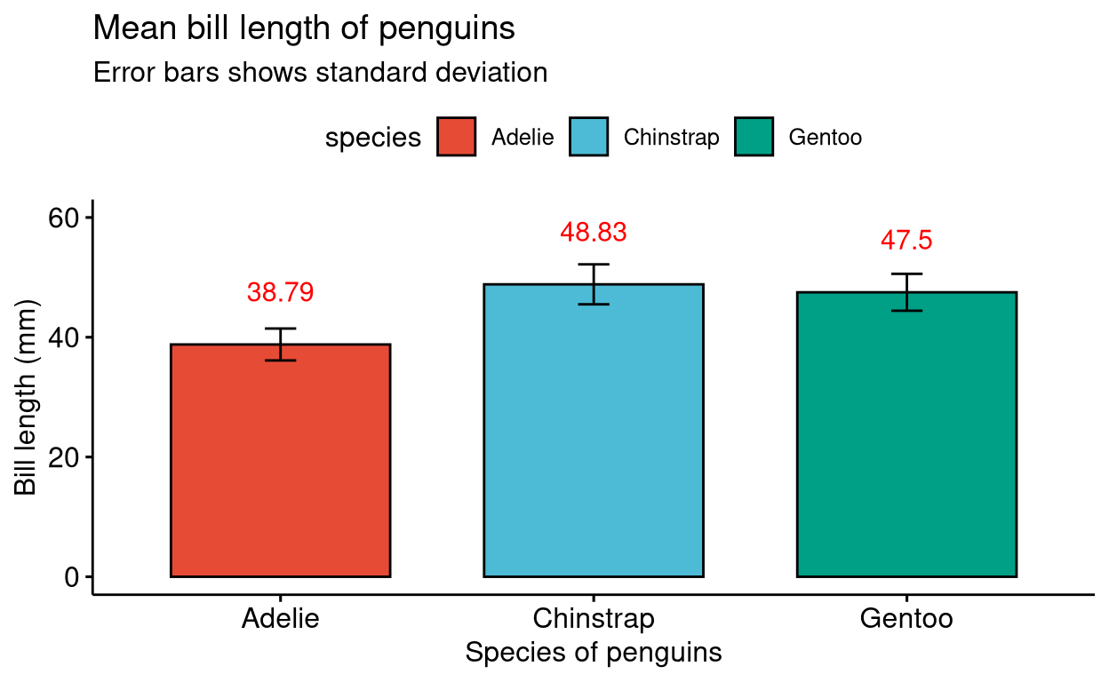
3. Box plot
Standard box plot graph. Like in the previous graph you can specify colour palettes from the scientific journal palettes featured in the ggsci R package.
# install.packages("palmerpenguins")
# library(palmerpenguins)
ggboxplot(penguins ,
          x = "species",
          y = "bill_depth_mm",
          title = "Mean bill depth of penguins",
          xlab = "Species of penguins",
          ylab = "Bill depth (mm)",
          color = "species",
          palette = "futurama",
          add = "jitter",
          shape = "species")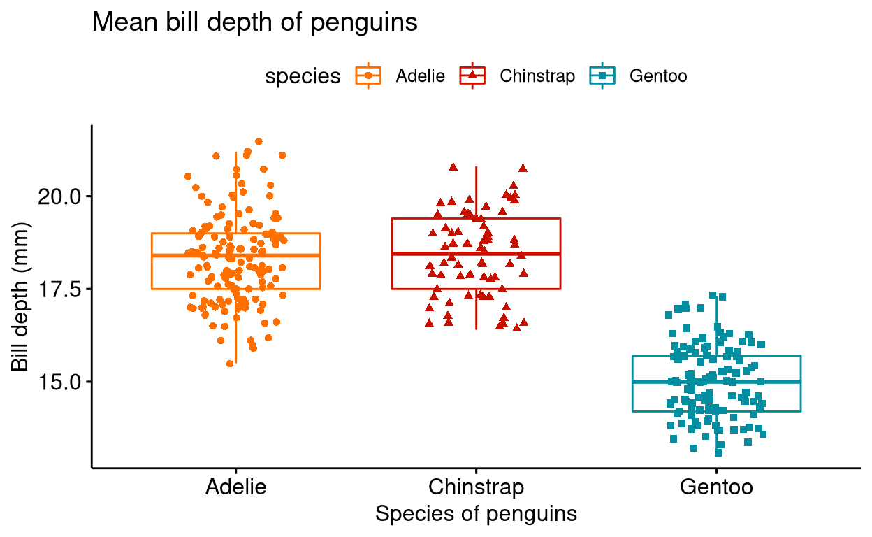
4. Violin plot
A simple violin plot.
# install.packages("palmerpenguins")
# library(palmerpenguins)
ggviolin(penguins ,
          x = "species",
          y = "bill_depth_mm",
          title = "Mean bill depth of penguins",
          xlab = "Species of penguins",
          ylab = "Bill depth (mm)",
          fill = "species",
          palette = "npg",
          add = "boxplot",
          shape = "species")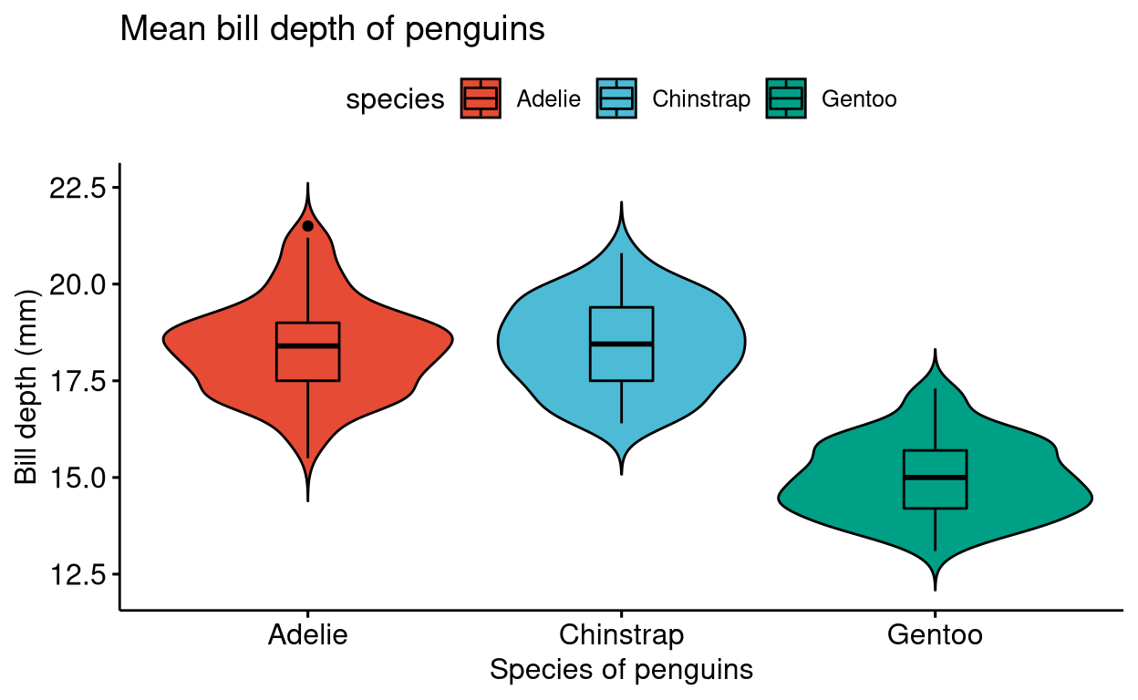
5. Density plot
Standard density plot.
# install.packages("palmerpenguins")
# library(palmerpenguins)
ggdensity(penguins,
          x = "body_mass_g",
          color = "species",
          rug = TRUE,
          fill = "species",
          add = "mean",
          title = "Mean body mass of penguins",
          xlab = "Body mass (g)",
          palette = "lancet")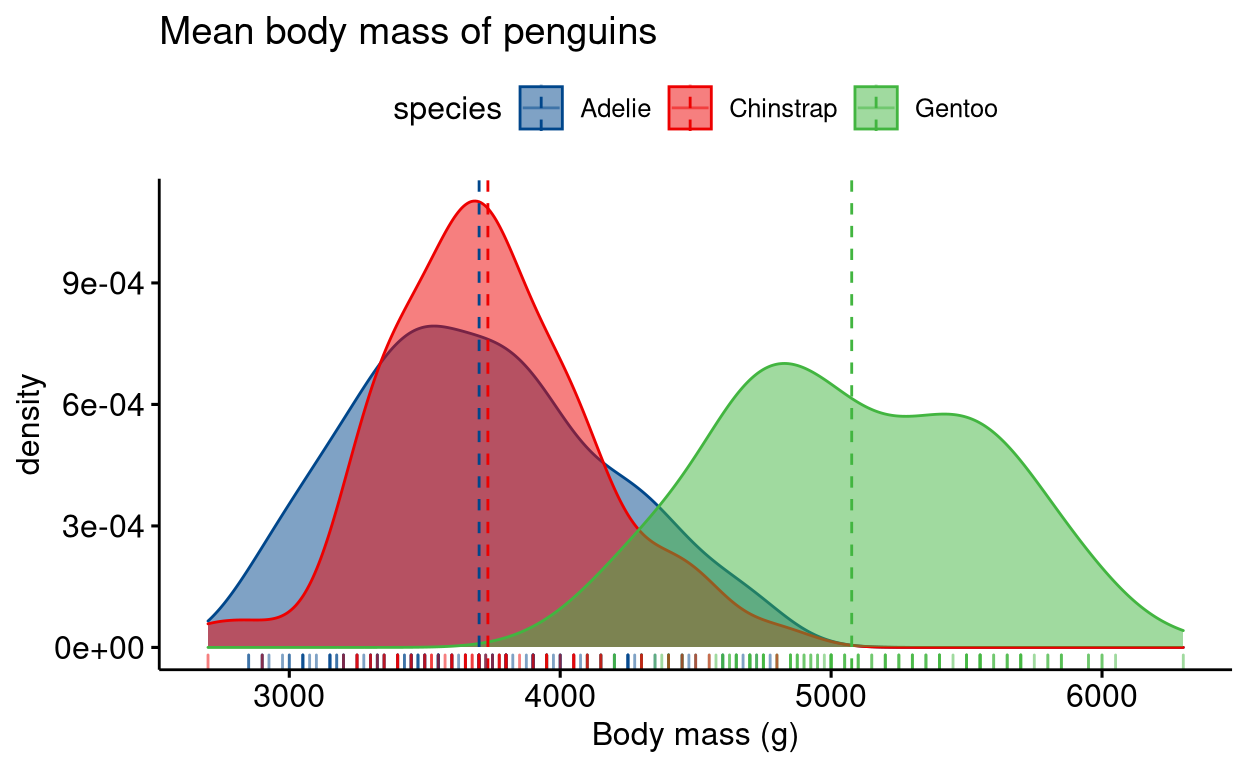
6. Donut chart
Similar to a pie diagram. Also please note that you don’t have to explicitly mention x and y parameters in the command. You can simply just type the column names, the first column name will be shown on the x-axis and the second on the y axis.
# install.packages("palmerpenguins")
# library(palmerpenguins)
# library(dplyr)
# library(tidyr)
penguins_freq <- penguins %>% drop_na() %>%
  group_by(species) %>%
  summarise(frequency = length(species))

labs <- paste0(penguins_freq$species, " (", round((penguins_freq$frequency/sum(penguins_freq$frequency))*100, digits = 0), "%)")

ggdonutchart(penguins_freq,
             "frequency",
             label = labs,
             fill = "species",
             palette = "ucscgb",
             lab.pos = "in",
             title = "Frequency of penguins")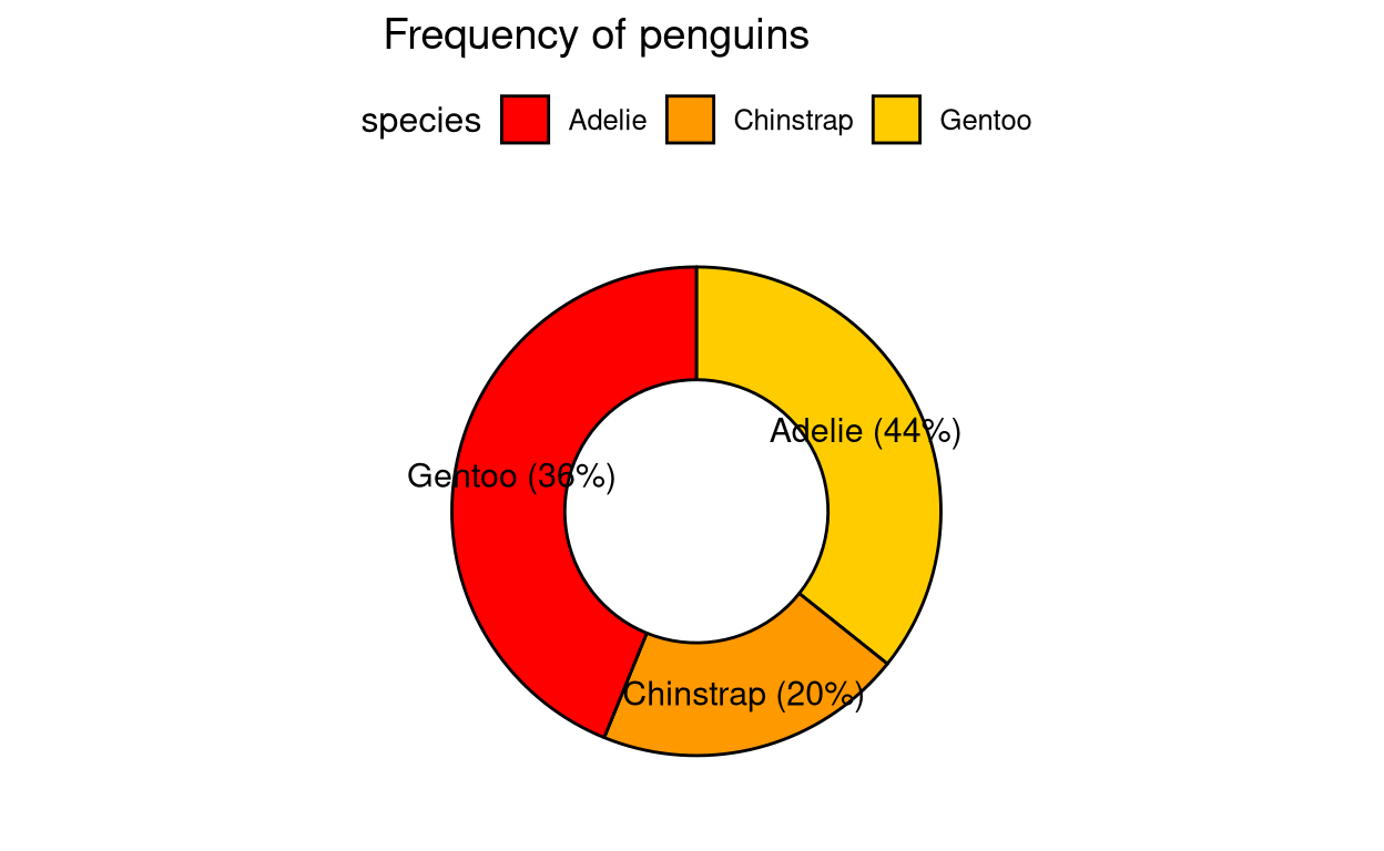
7. Pie chart
Simple pie chart.
# install.packages("palmerpenguins")
# library(palmerpenguins)
# library(dplyr)
# library(tidyr)
penguins_freq <- penguins %>% drop_na() %>%
  group_by(species) %>%
  summarise(frequency = length(species))

labs <- paste0(penguins_freq$species, " (", round((penguins_freq$frequency/sum(penguins_freq$frequency))*100, digits = 0), "%)")

ggpie(penguins_freq,
             "frequency",
             label = labs,
             fill = "species",
             palette = "futurama",
             lab.pos = "in",
             title = "Frequency of penguins")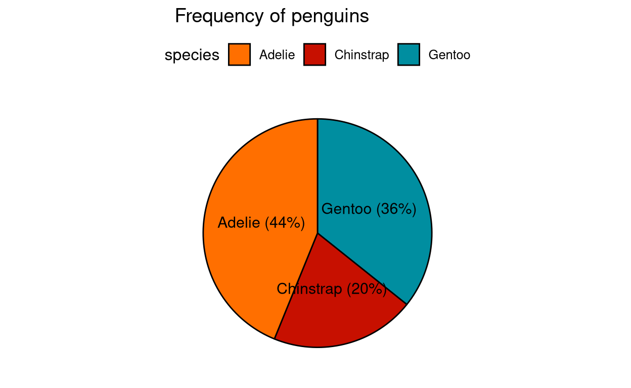
8. Dot chart
This is an upgrade from bar charts where the data is displayed with minimum clutter in the form of dots. This allows the readers to not get bothered about things like the slope of a line in case of line plots, or width of bars in case of bar charts or any other confusing aesthetics of a plot. You can read more about this graph here. It is also called “Cleveland dot plots” named after the founder of this plot.
mtcars %>% rownames_to_column(var = "car_names") %>%
  mutate(cyl = as.factor(cyl)) %>%
  ggdotchart("car_names",
             "mpg",
             color = "cyl",
             palette = "aaas",
             sorting = "ascending",
             rotate = TRUE,
             y.text.col = TRUE,
             dot.size = 2,
             ylab = "Miles per gallon of fuel",
             title = "Mileage of different cars",
ggtheme = theme_pubr()) + theme_cleveland() 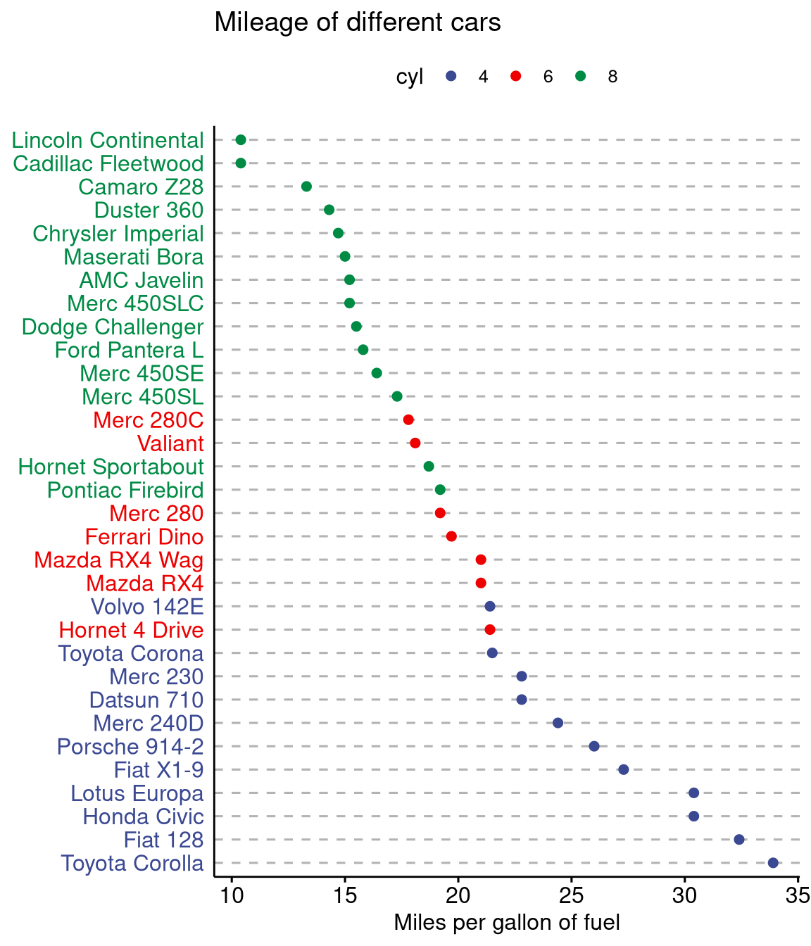
9. Dot plot
Simple dot plot. Similar to a box plot. You can also overlay a box plot or a violin plot over the dot plot using the add function inside the main function.
# install.packages("palmerpenguins")
# library(palmerpenguins)

ggdotplot(penguins ,
          x = "species",
          y = "bill_depth_mm",
          title = "Mean bill depth of penguins",
          subtitle = "Error bars shows standard deviation",
          xlab = "Species of penguins",
          ylab = "Bill depth (mm)",
          fill = "species",
          add = "mean_sd",
          palette = "locuszoom")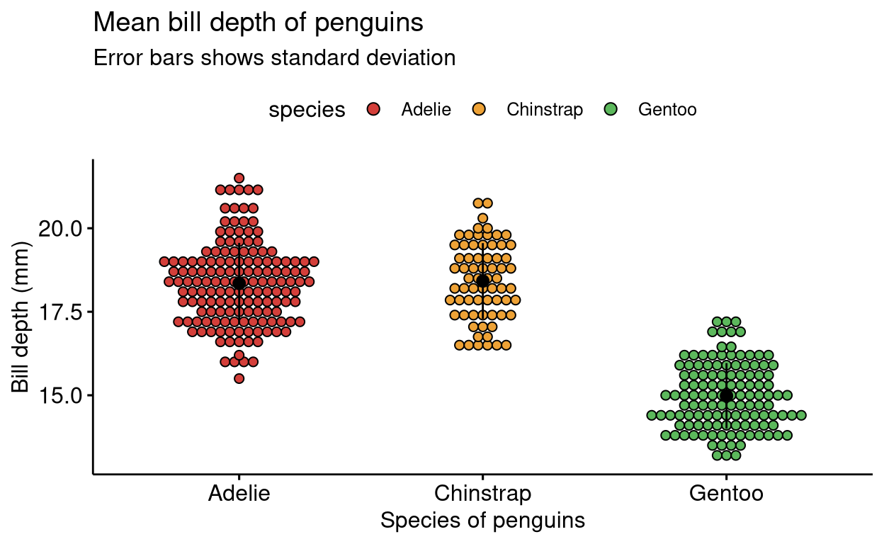
10. Histogram plot
The same function as that of a density plot but the data is represented in bars.
# install.packages("palmerpenguins")
# library(palmerpenguins)
gghistogram(penguins,
            x = "body_mass_g",
            add = "mean",
            fill = "species",
            rug = TRUE,
            title = "Body mass of penguins",
            xlab = "Body mass (g)",
            ylab = "Frequency",
            palette = "startrek")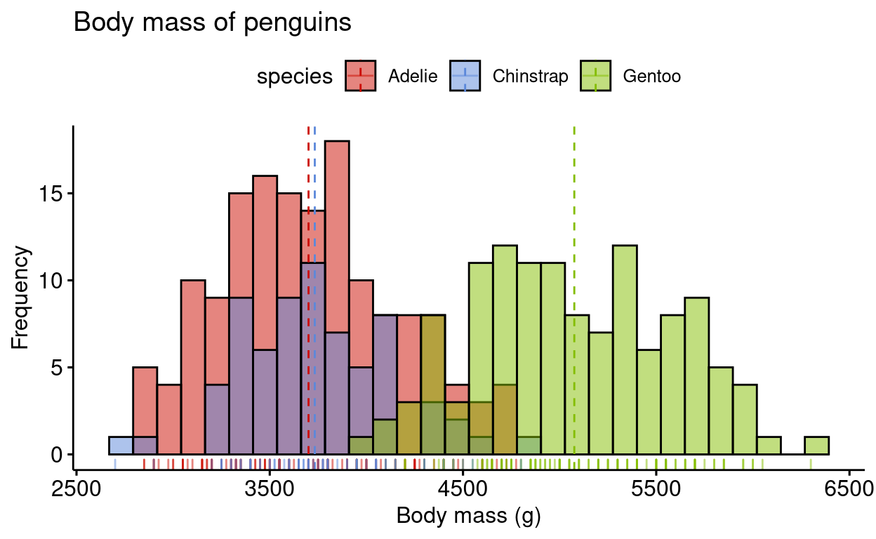
11. Line plot
A simple line plot.
# install.packages("palmerpenguins")
# library(palmerpenguins)
ggline(penguins,
      x = "body_mass_g",
      y = "bill_depth_mm",
      linetype = "species",
      shape = "species",
      color = "species",
      title = "Body mass vs Bill depth",
      xlab = "Body mass (g)",
      ylab = "Bill depth (mm)",
      palette = "startrek")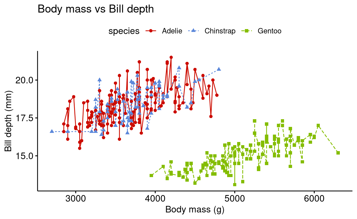
12. Plotting paired data
This is essentially a box plot but for paired data. Widely used to represent treatment groups showing before and after results of the same sample. We will be using the Anorexia dataset from the PairedData package in R. It features weights of girls before and after treatment for Anorexia.
# install.packages("PairedData")
# library(PairedData)
data("Anorexia")
Anorexia %>%
  ggpaired(cond1 = "Prior",
           cond2 = "Post",
           title = "Weights of girls before and after treatment for anorexia",
           xlab = "Condition",
           ylab = "Weight (lbs)",
           fill = "condition",
           line.color = "darkgreen",
           line.size = 0.2,
           palette = "simpsons")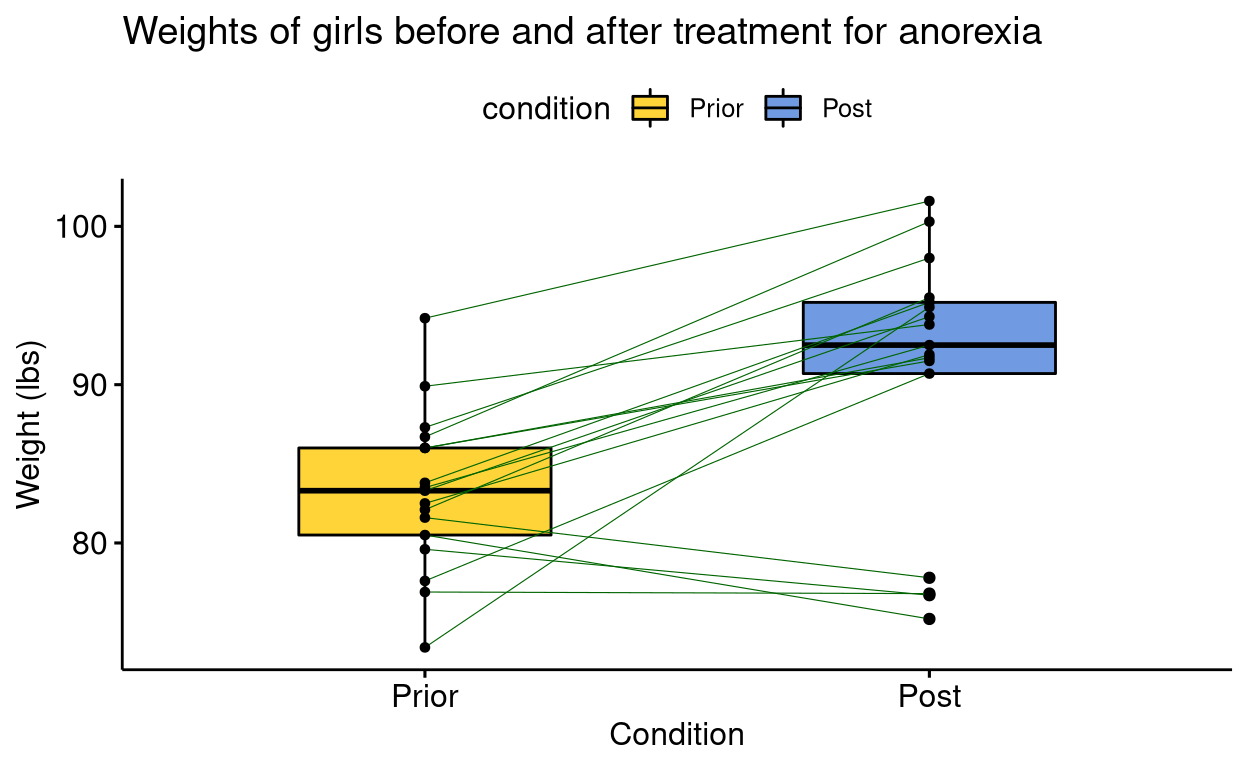
13. Quantile-Quantile plot
Quantile-Quantile plot or QQ plot is useful in assessing the distribution of a data. A data having normal distribution will be shown as a straight line of the formula ‘y=x’ in the QQ plot. Points outside the confidence interval are outliers in the data.
# install.packages("palmerpenguins")
# library(palmerpenguins)
penguins %>% ggqqplot("body_mass_g",
                      color = "species",
                      palette = "aaas",
                      title = "Quantile-Quantile plot")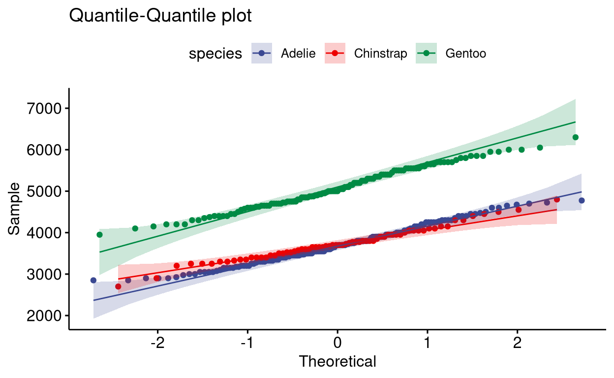
14. Scatter plot
A simple scatter plot.
# install.packages("palmerpenguins")
# library(palmerpenguins)
penguins %>% filter(species == "Chinstrap") %>%
  ggscatter("body_mass_g",
            "bill_length_mm",
            add = "reg.line",
            add.params = list(color = "darkred", fill = "yellow"),
            cor.coef = TRUE,
            cor.method = "pearson",
            conf.int = TRUE,
            title = "Body mass distribution of Chinstrap penguins",
            subtitle = "Correlation method used was Pearson",
            xlab = "Body mass (g)",
            ylab = "Bill lenght (mm)")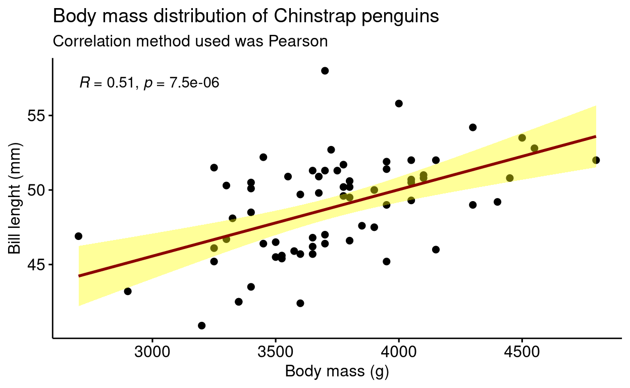
You can also use scatter plot for data having different categories. Using ellipse=TRUE you can group data to its category.
# install.packages("palmerpenguins")
# library(palmerpenguins)
penguins %>%
  ggscatter("body_mass_g",
            "bill_length_mm",
            color = "species",
            alpha = 0.5,
            palette = "d3",
            ellipse = TRUE, #adds an ellipse to group data of different category
            title = "Body mass vs Bill length",
            xlab = "Body mass (g)",
            ylab = "Bill length (mm)")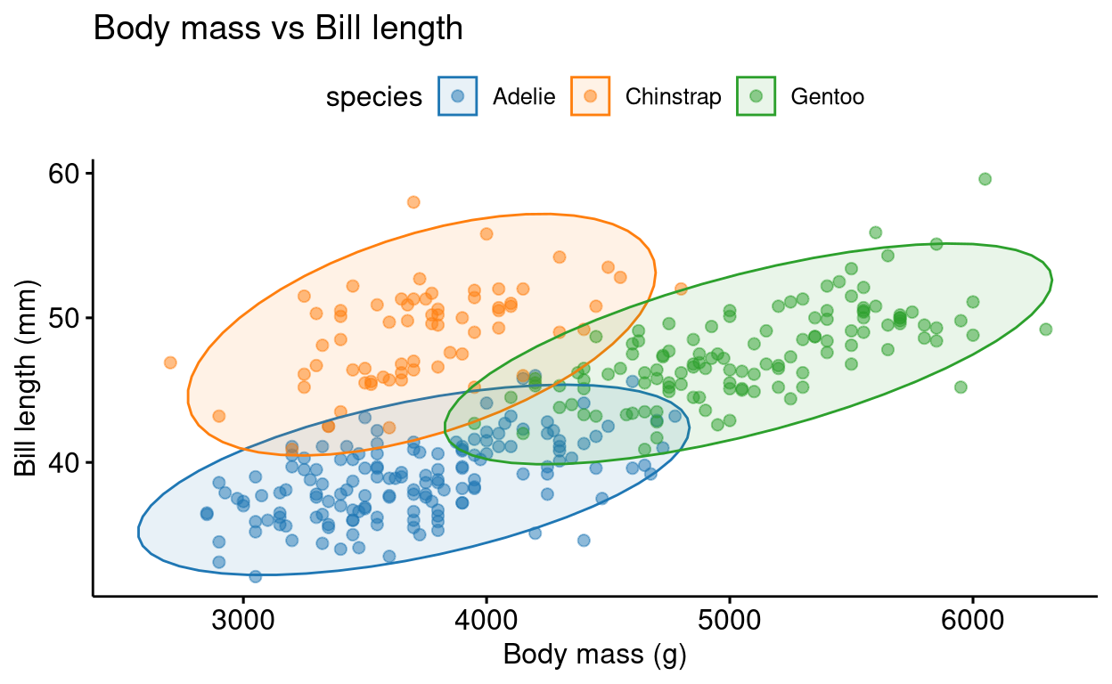
You can also label points in the scatter plot using the label function.
mtcars %>% rownames_to_column(var = "car_names") %>%
  mutate(cyl = as.factor(cyl)) %>%
  ggscatter("wt",
             "mpg",
             color = "cyl",
             palette = "nejm",
             xlab = "Weight (1000 lbs)",
             ylab = "Miles per gallon of fuel",
             title = "Mileage vs Weight of different cars",
             label = "car_names",
             repel = TRUE,
ggtheme = theme_pubr()) + theme_cleveland() 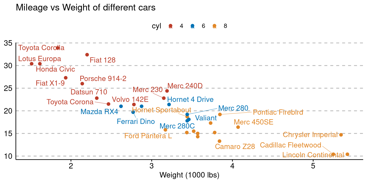
15. Scatter Plot with Marginal Histograms
This is plot is a combination of scatter plot and histograms.
# install.packages("palmerpenguins")
# library(palmerpenguins)
penguins %>%
  ggscatterhist("body_mass_g",
            "bill_length_mm",
            color = "species",
            alpha = 0.5, size = 2,
            palette = "futurama",
            margin.params = list(fill = "species", color = "black", size = 0.2),
            title = "Body mass distribution of penguins",
            xlab = "Body mass (g)",
            ylab = "Bill length (mm)")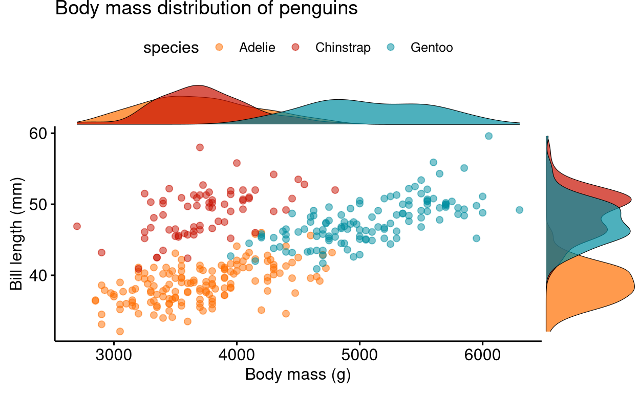
You can also choose to show box plots.
# install.packages("palmerpenguins")
# library(palmerpenguins)
penguins %>%
  ggscatterhist("body_mass_g",
            "bill_depth_mm",
            color = "species",
            alpha = 0.5, size = 2,
            palette = "futurama",
            margin.plot = "boxplot",
            title = "Body mass vs Bill depth",
            xlab = "Body mass (g)",
            ylab = "Bill depth (mm)",
            ggtheme = theme_bw())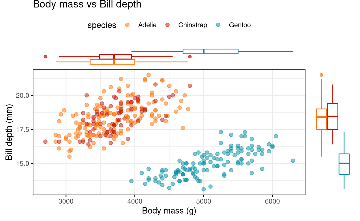
Other functions in ggpubr package
1. Statistical tests
You can do various statistical tests using the functions in the ggpubr package. We will be using the Anorexia dataset in the PairedData package in R. In the code given below, we are doing a Wilcoxon test to compare the mean weights of girls before treatment to the mean weights of girls post-treatment. Since the data is paired we will indicate it by the paired = TRUE function. A word of caution! Before starting to do statistical tests please ensure whether you can fulfil conditions for using parametric tests or not using or data. You can check whether your data is normally distributed using a QQ plot or by using any normality tests.
# install.packages("PairedData")
# library(PairedData)
# library(dplyr)
# library(tidyr)

data("Anorexia")

# tidying the data
Anorexia_new <- Anorexia %>%
  pivot_longer(c(Prior, Post), names_to = "condition", values_to = "weight")
compare_means(weight ~ condition, Anorexia_new, paired = TRUE)
You can also do parametric tests like ANOVA and its non-parametric version; the Kruskal-Wallis test, which can be followed by multiple pairwise comparisons.
compare_means(body_mass_g ~ species, penguins, method = "anova")
compare_means(body_mass_g ~ species, penguins, method = "kruskal.test")
# multiple pairwise comparisons
# when there is more than two levels, the function automatically does pairwise comparisons
compare_means(body_mass_g ~ species, penguins)2. Descriptive statistics by groups
Using the function desc_statby() we can get the summary statistics of a dataset in the form of a data frame. Similar to the summary() function in base R.
desc_statby(penguins, measure.var = "body_mass_g", grps = "species")You can also show the data as a table using the ggtexttable() function.
summary <- desc_statby(penguins, measure.var = "body_mass_g", grps = "species")
summary_short <- summary %>% dplyr::select(species, mean, median, se, sd)
summary_tbl <- ggtexttable(summary_short, rows = NULL, theme = ttheme("mRed")) # use ?ttheme to see more themes
summary_tbl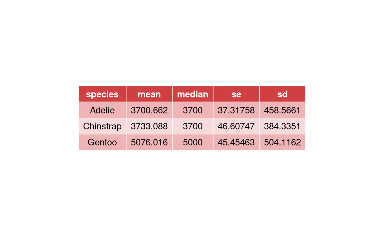
3. Showing p-values and statistical results within plots
Using various functions you can show statistical outputs within the plots.
Using Wilcoxon test for paired data.
# install.packages("PairedData")
# library(PairedData)
data("Anorexia")
Anorexia %>%
  ggpaired(cond1 = "Prior",
           cond2 = "Post",
           title = "Weights of girls before and after treatment for anorexia",
           xlab = "Condition",
           ylab = "Weight (lbs)",
           fill = "condition",
           line.color = "darkgreen",
           line.size = 0.2,
           palette = "simpsons") + stat_compare_means(paired = TRUE)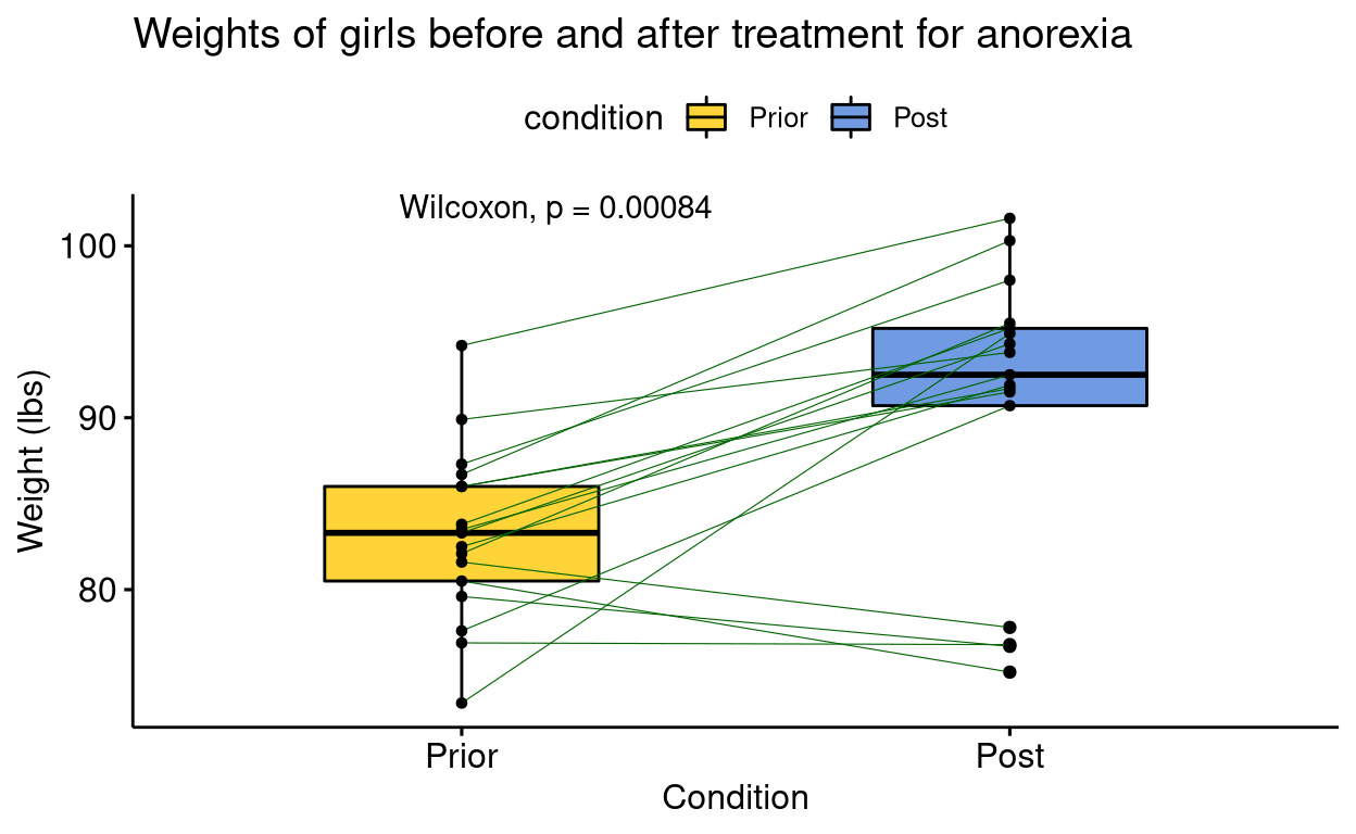
Using t-test
# install.packages("palmerpenguins")
# library(palmerpenguins)
penguins %>% filter(species == "Adelie" & island == c("Biscoe","Torgersen")) %>%
ggboxplot(x = "island",
          y = "bill_depth_mm",
          title = "Mean bill depth of penguins",
          xlab = "Island",
          ylab = "Bill depth (mm)",
          color = "island",
          palette = "futurama",
          add = "jitter",
          shape = "island") + stat_compare_means(method = "t.test")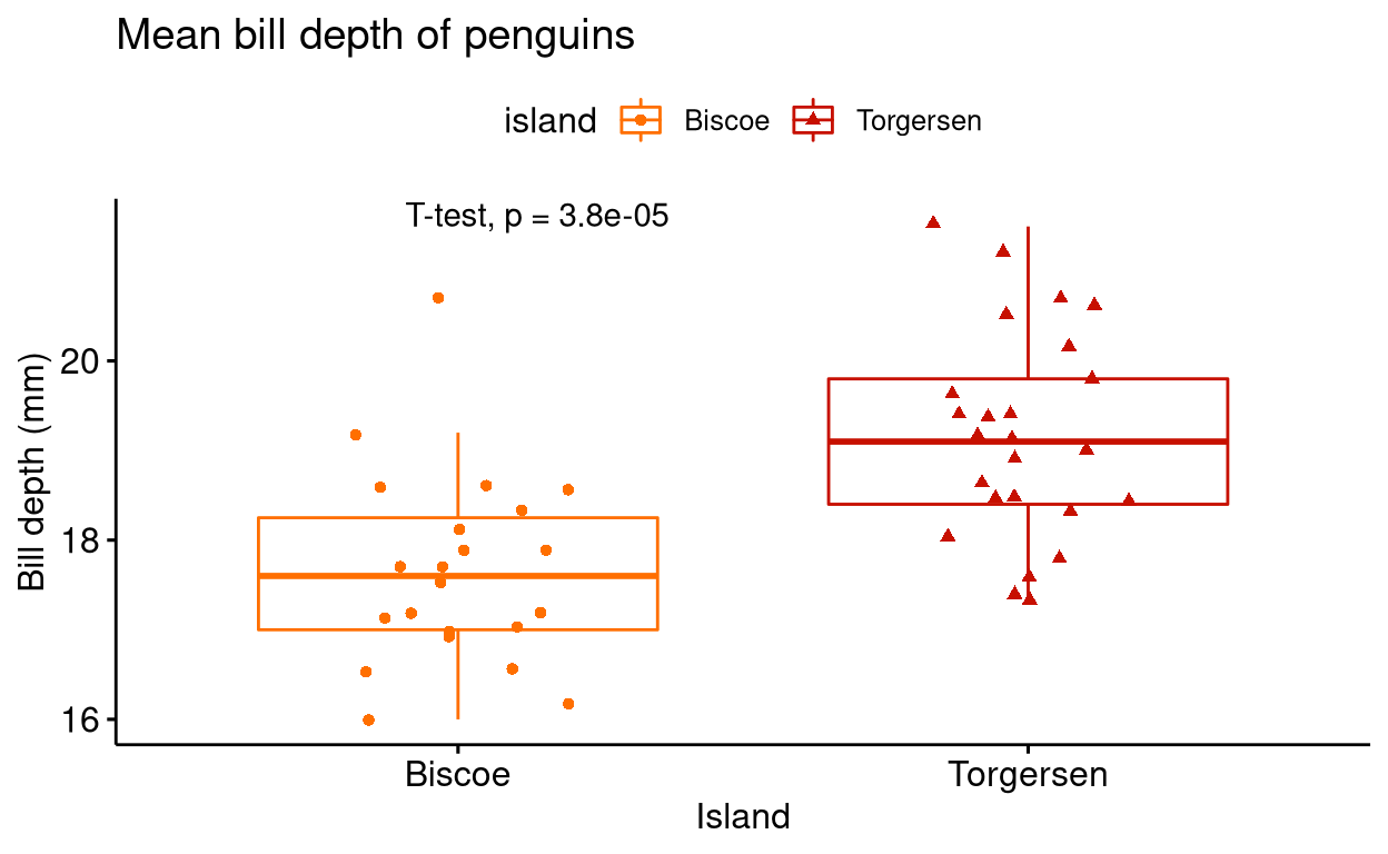
Using ANOVA test and t-test as post hoc test. For pairwise comparison, we have to manually list out the pairwise comparisons that we want.
# install.packages("palmerpenguins")
# library(palmerpenguins)

# listing out pairwise comparisons
compare <- list(c("Adelie", "Chinstrap"), c("Adelie", "Gentoo"), c("Chinstrap", "Gentoo"))

ggboxplot(penguins ,
          x = "species",
          y = "bill_depth_mm",
          title = "Mean bill depth of penguins",
          xlab = "Species of penguins",
          ylab = "Bill depth (mm)",
          color = "species",
          palette = "futurama",
          add = "jitter",
          shape = "species") +
  stat_compare_means(method = "anova", label.y = 25) + #anova test
  stat_compare_means(comparisons = compare, method = "t.test") # post hoc test using t-test
Using Kruskal-Wallis test and Wilcoxon test as post hoc test.
# install.packages("palmerpenguins")
# library(palmerpenguins)
compare <- list(c("Adelie", "Chinstrap"), c("Adelie", "Gentoo"), c("Chinstrap", "Gentoo"))
ggboxplot(penguins ,
          x = "species",
          y = "bill_depth_mm",
          title = "Mean bill depth of penguins",
          xlab = "Species of penguins",
          ylab = "Bill depth (mm)",
          color = "species",
          palette = "futurama",
          add = "jitter",
          shape = "species") +
  stat_compare_means(label.y = 25) + #anova test
  stat_compare_means(comparisons = compare) # post hoc test using t-test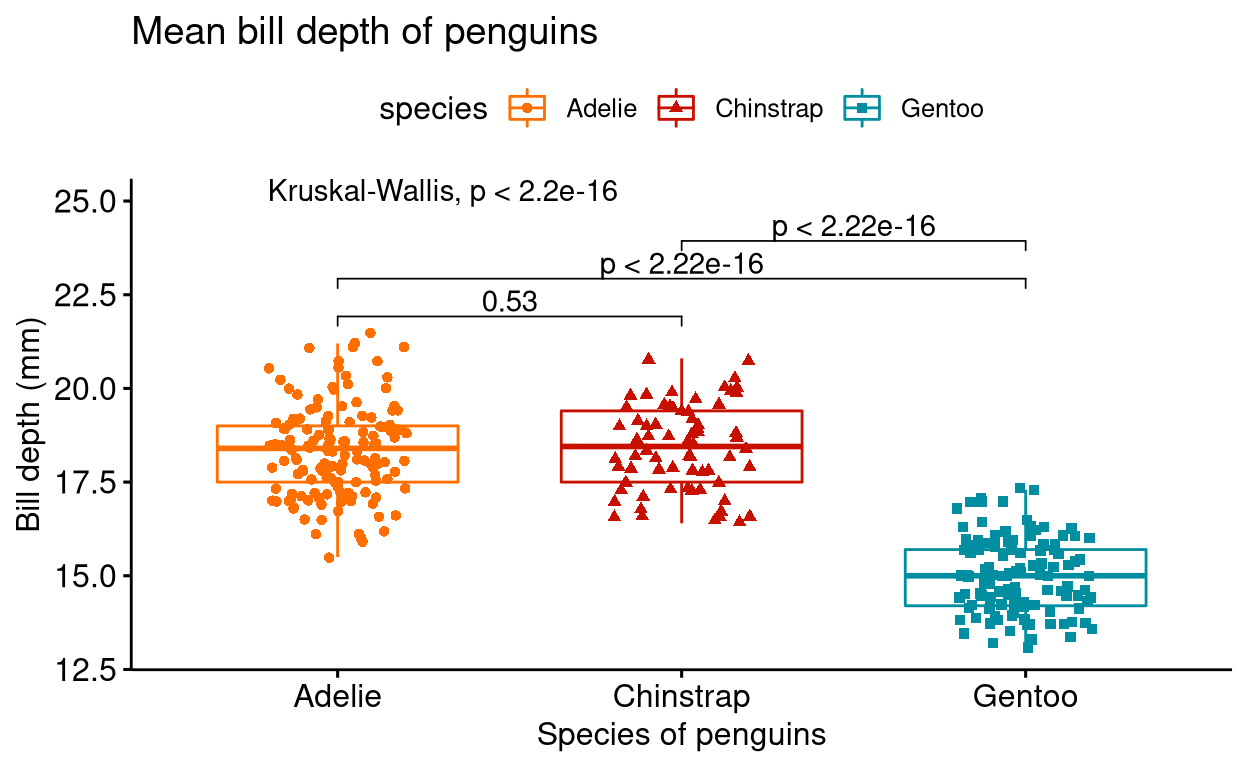
You can also choose to show only asterisks as significance levels
# install.packages("palmerpenguins")
# library(palmerpenguins)
compare <- list(c("Adelie", "Chinstrap"), c("Adelie", "Gentoo"), c("Chinstrap", "Gentoo"))
ggboxplot(penguins ,
          x = "species",
          y = "bill_depth_mm",
          title = "Mean bill depth of penguins",
          xlab = "Species of penguins",
          ylab = "Bill depth (mm)",
          color = "species",
          palette = "futurama",
          add = "jitter",
          shape = "species") +
  stat_compare_means(label.y = 25) +
  stat_compare_means(comparisons = compare, label = "p.signif")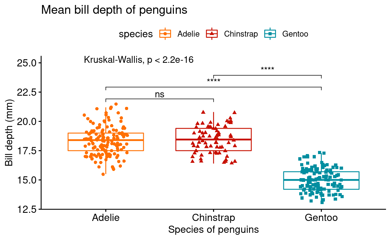
For illustrative purposes, I have used box plots for showing p-values and statistical test results, but you can do the same with most of the other types of graphs shown in this chapter.
4. Faceting plots into grids
You can also facet different plots into grids using the function facet.by.
# install.packages("palmerpenguins")
# library(palmerpenguins)
penguins %>% drop_na() %>%
  ggscatter("body_mass_g",
            "bill_length_mm",
            color = "species",
            alpha = 0.5,
            palette = "d3",
            facet.by = c("island", "sex"), # faceting graphs via island and sex categories
            title = "Body mass vs Bill length",
            xlab = "Body mass (g)",
            ylab = "Bill length (mm)")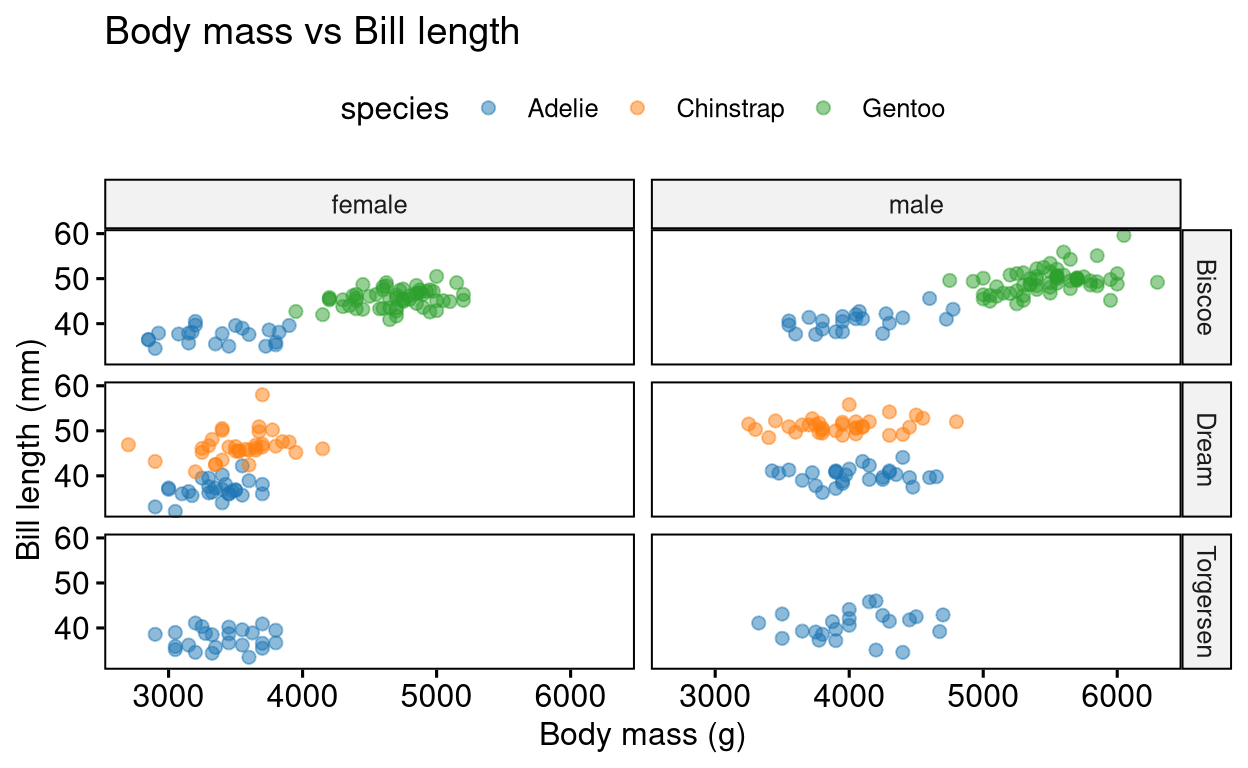
5. Adding paragraph
You can also add a paragraph beneath the plot of your interest using the ggparagraph() and ggarrange() functions.
# install.packages("PairedData")
# library(PairedData)
data("Anorexia")

text <- paste("The above dataset shows the weight (in lbs) of 17 girls before",
              "and after they got treatment for anorexia.", sep = " ")

text_plot <- ggparagraph(text, face = "bold", size = 12)

plot <- Anorexia %>%
  ggpaired(cond1 = "Prior",
           cond2 = "Post",
           title = "Weights of girls before and after treatment for anorexia",
           xlab = "Condition",
           ylab = "Weight (lbs)",
           fill = "condition",
           line.color = "darkgreen",
           line.size = 0.2,
           palette = "simpsons")

ggarrange(plot, text_plot,
         ncol = 1, nrow = 2,
         heights = c(1, 0.3))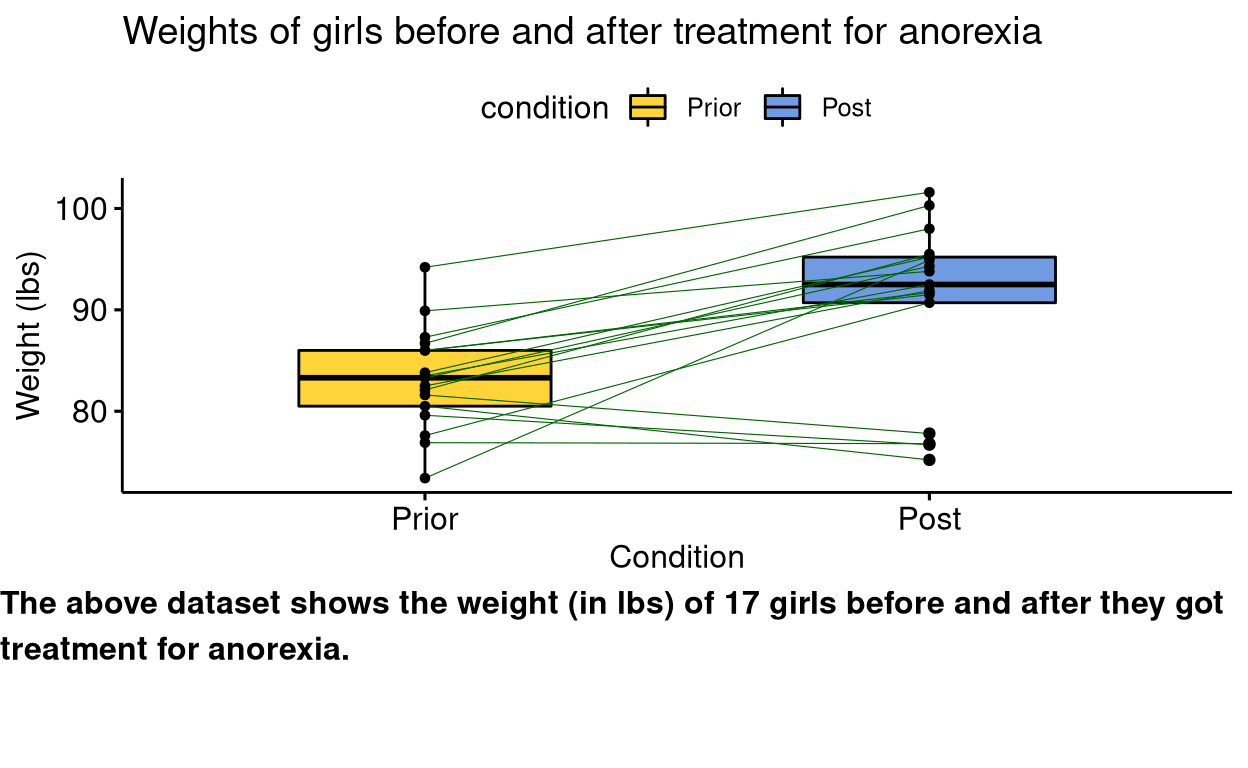
6. Having plots adjacent to each other
You can use the ggarrange() function to place different plots together.
# install.packages("palmerpenguins")
# library(palmerpenguins)
bar_plot <- ggbarplot(penguins,
          x = "species",
          y = "bill_length_mm",
          add = c("mean_sd"),
          fill = "species",
          label = TRUE,
          lab.nb.digits = 2,
          lab.vjust = -2.2,
          lab.col = "red",
          title = "Mean bill length of penguins",
          subtitle = "Error bars shows standard deviation",
          xlab = "Species of penguins",
          ylab = "Bill length (mm)",
          ylim = c(0,60),
          palette = "npg")

histogram <- gghistogram(penguins,
            x = "body_mass_g",
            add = "mean",
            fill = "species",
            rug = TRUE,
            title = "Body mass of penguins",
            xlab = "Body mass (g)",
            ylab = "Frequency",
            palette = "startrek")

summary <- desc_statby(penguins, measure.var = "body_mass_g", grps = "species")
summary_short <- summary %>% dplyr::select(species, mean, median, se, sd)
summary_tbl <- ggtexttable(summary_short, rows = NULL, theme = ttheme("mRed")) # use ?ttheme to see more themes

# arranging plots together
ggarrange(bar_plot, histogram,
         ncol = 2, nrow = 2, labels = c("A", "B"),
         heights = c(1, 0.3))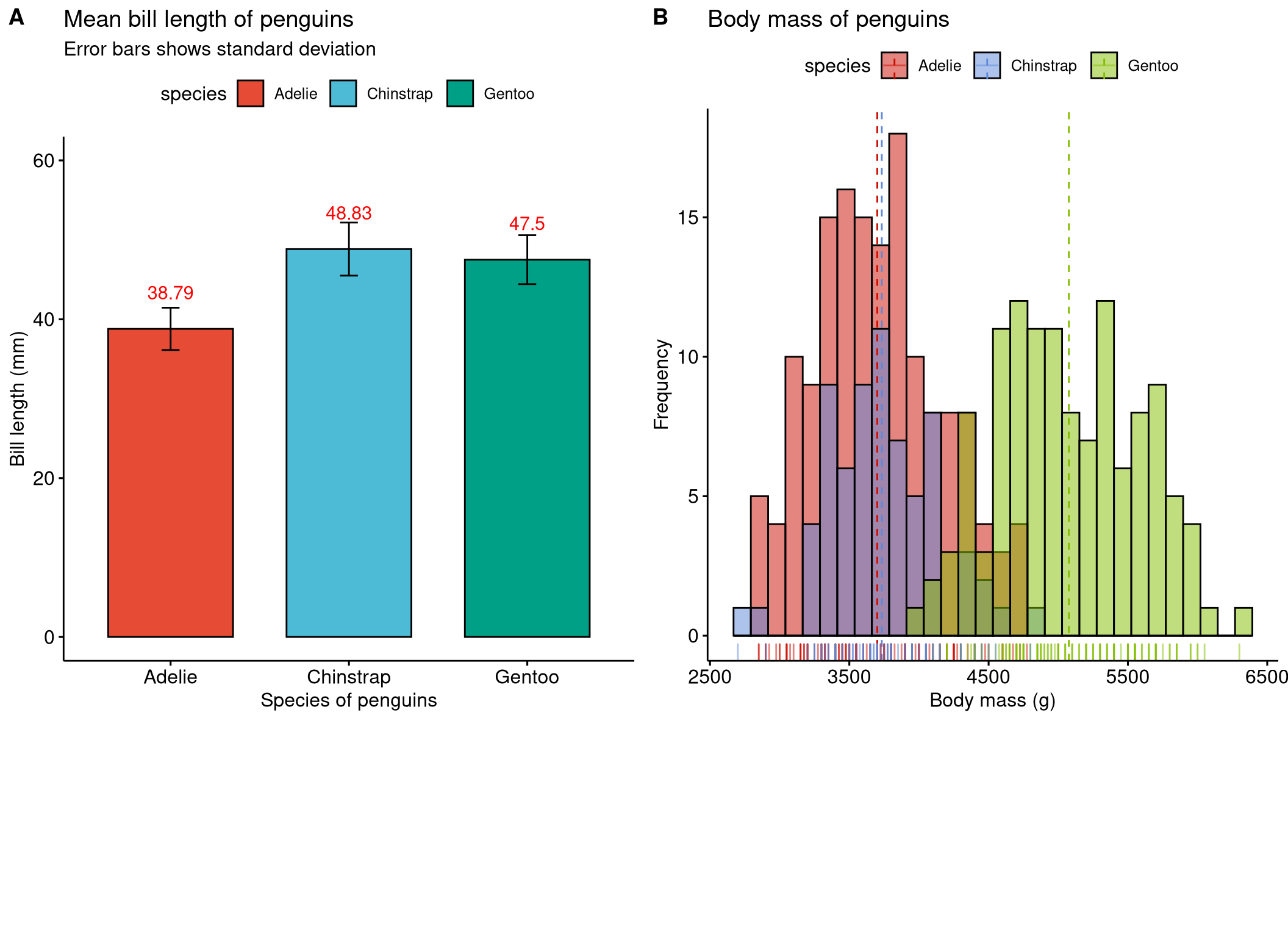
If you are arranging three graphs it is better to use the grid.arrange() function from the gridExtra package in R.
# install.packages("palmerpenguins")
# library(palmerpenguins)
bar_plot <- ggbarplot(penguins,
          x = "species",
          y = "bill_length_mm",
          add = c("mean_sd"),
          fill = "species",
          label = TRUE,
          lab.nb.digits = 2,
          lab.vjust = -2.2,
          lab.col = "red",
          title = "Mean bill length of penguins",
          subtitle = "Error bars shows standard deviation",
          xlab = "Species of penguins",
          ylab = "Bill length (mm)",
          ylim = c(0,60),
          palette = "npg")

histogram <- gghistogram(penguins,
            x = "body_mass_g",
            add = "mean",
            fill = "species",
            rug = TRUE,
            title = "Body mass of penguins",
            xlab = "Body mass (g)",
            ylab = "Frequency",
            palette = "startrek")

summary <- desc_statby(penguins, measure.var = "body_mass_g", grps = "species")
summary_short <- summary %>% dplyr::select(species, mean, median, se, sd)
summary_tbl <- ggtexttable(summary_short, rows = NULL, theme = ttheme("mRed")) # use ?ttheme to see more themes

# arranging three plots together
layout_matrix <- matrix(c(1, 1, 2, 2, 4, 3, 3, 4), nrow = 2, byrow = TRUE)
library(gridExtra)
grid.arrange(bar_plot, histogram, summary_tbl, layout_matrix = layout_matrix)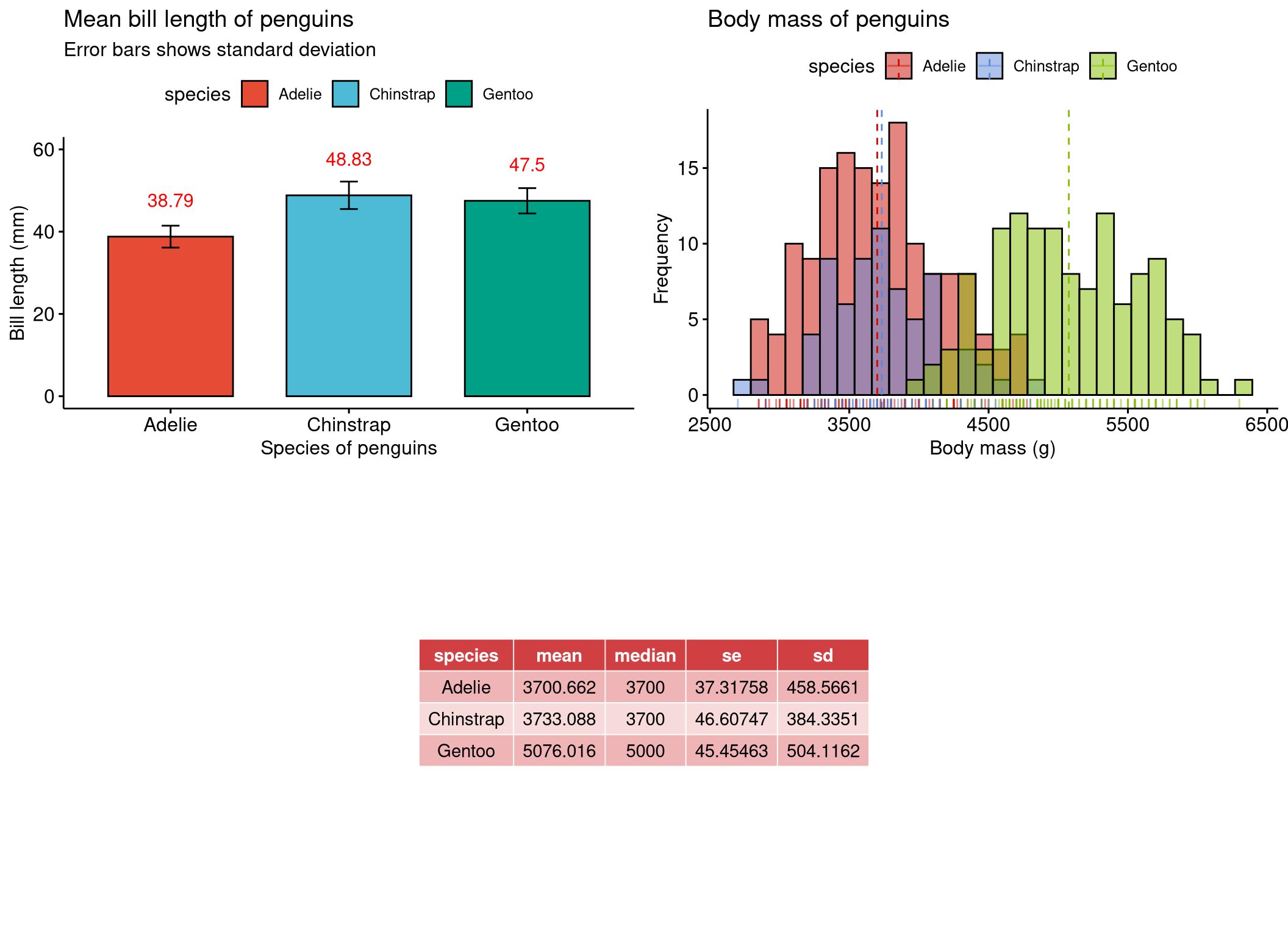
Saving your plot
Using the function ggexport() you can save your plot. Tweak width and height accordingly and also change the resolution to fit your needs.
# install.packages("palmerpenguins")
# library(palmerpenguins)
penguins %>%
  ggscatterhist("body_mass_g",
            "bill_length_mm",
            color = "species",
            alpha = 0.5, size = 2,
            palette = "futurama",
            margin.params = list(fill = "species", color = "black", size = 0.2),
            title = "Body mass distribution of penguins",
            xlab = "Body mass (g)",
            ylab = "Bill length (mm)") %>%
  ggexport(filename = "my_plot.png", width = 800, height = 600, res = 150)
Summary
In this chapter we learned how to plot publication standard graphs using the ggpubr package in R. Even with little to no experience in using the ggplot2 package in R, one can plot graphs with ease using the ggpubr package. To quickly recap, from this chapter we saw;
- How to plot around 15 different types of graphs
- How to facet plots
- How to do basic statistical tests and visualize them within graphs
- How to add paragraph text under the graphs
- How to group different graphs into one single file
I hope this chapter was useful to you. See you next time!
Previous chapter:
3: Even more customizations in ggplot2
References
Alboukadel Kassambara (2020). ggpubr: ‘ggplot2’ Based Publication Ready Plots. R package version 0.4.0. https://CRAN.R-project.org/package=ggpubr
Horst AM, Hill AP, Gorman KB (2020). palmerpenguins: Palmer Archipelago (Antarctica) penguin data. R package version 0.1.0. https://allisonhorst.github.io/palmerpenguins/
Stephane Champely (2018). PairedData: Paired Data Analysis. R package version 1.1.1. https://CRAN.R-project.org/package=PairedData
William S. Cleveland & Robert McGill (1984) Graphical Perception: Theory, Experimentation, and Application to the Development of Graphical Methods, Journal of the American Statistical Association, 79:387, 531-554, DOI: 10.1080/01621459.1984.10478080
Hadley Wickham, Romain François, Lionel Henry and Kirill Müller (2021). dplyr: A Grammar of Data Manipulation. R package version 1.0.7. https://CRAN.R-project.org/package=dplyr
Hadley Wickham (2021). tidyr: Tidy Messy Data. R package version 1.1.4. https://CRAN.R-project.org/package=tidyr
H. Wickham. ggplot2: Elegant Graphics for Data Analysis. Springer-Verlag New York, 2016.
Simon Garnier, Noam Ross, Robert Rudis, Antônio P. Camargo, Marco Sciaini, and Cédric Scherer (2021). Rvision - Colorblind-Friendly Color Maps for R. R package version 0.6.2.
Last updated on
[1] "2022-01-06 20:10:46 IST"