Getting the data
In this post we will do some exploratory data visualizations using data from The World Happiness Report 2021. You can download the .csv file from here.
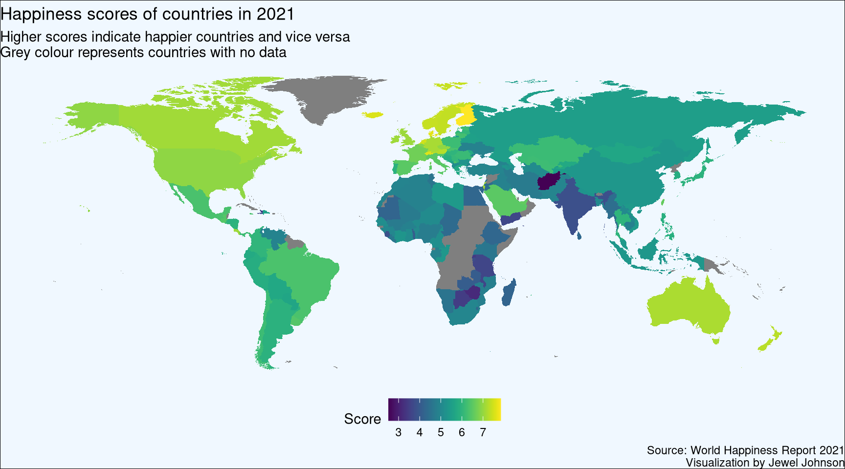
World Happiness Report 2021 shows which are the happiest countries in the year 2021. By statistically analysing six key parameters, each country is given a score (which is called ‘Ladder score’ within the dataset). The higher the score, the happier the country is and vice versa. The six key parameters which are taken into analysis for determining the score are;
- Gross domestic product per capita
- Social support
- Healthy life expectancy
- Freedom to make your own life choices
- Generosity of the general population
- Perceptions of internal and external corruption levels.
Finland is ranked first among 149 countries with an overall score of 7.84. Despite COVID 19 wrecking havoc around the world, citizens of Finland have persevered through it and they have been maintaining first rank since 2016. Afghanistan is at the lowest rank with a score of 2.52. With complications from COVID 19 pandemic and the Taliban take over, Afghanistan is going through one of the worst humanitarian crisis in human history and this ranking is a result of that.
Plotting a world map
We will plot a world map with a scalable colour palette based on the ladder score where greater scores indicated happier countries and vice versa.
In short what we are doing is, we are going to join the World Happiness Report 2021 dataset with the map data and plot it using the {ggplot2} package. The map_data() function helps us easily turn data from the {maps} package in to a data frame suitable for plotting with ggplot2.
# load the dataset which you have downloaded
# please change the location to where your downloaded file is kept
hap_pre <- read.csv("/home/jeweljohnson/Work/datasets/world-happiness-report-2021.csv")

# renaming column names of ease of use
colnames(hap_pre)[1] <- "country"
colnames(hap_pre)[3] <- "score"

# selecting country and score columns
hap <- hap_pre %>% select(country,score)

# loading map
map_world <- map_data('world')
# remove Antarctica
map_world <- map_world[!map_world$region =="Antarctica",]

# checking which country names are a mismatch between map data and the downloaded dataset
anti_join(hap, map_world,  by = c("country" = "region"))
                    country score
1            United Kingdom 7.064
2             United States 6.951
3  Taiwan Province of China 6.584
4              North Cyprus 5.536
5 Hong Kong S.A.R. of China 5.477
6       Congo (Brazzaville) 5.342
7   Palestinian Territories 4.517
# display all country names in the dataset
# useful to locate correct country names
#map_world %>% group_by(region) %>% summarise() %>% print(n = Inf)
# correcting country names
# here we are matching the country names of downloaded dataset with the map data
correct_names <- c("United Kingdom" = "UK",
"United States" = "USA",
"Taiwan Province of China" = "Taiwan",
"North Cyprus"= "Cyprus",
"Congo (Brazzaville)"= "Republic of Congo",
"Palestinian Territories" = "Palestine")
# recoding country names
hap2 <- hap %>% mutate(country = recode(country, !!!correct_names))
# joining map and the data
world_hap <- left_join(map_world, hap2, by = c("region" = "country"))
# creating a function to add line in text, for the caption
addline_format <- function(x,...){
gsub(',','\n',x)}
# plotting the world map
ggplot(world_hap, aes(long, lat)) + geom_polygon(aes(fill = score, group = group)) +
scale_fill_viridis(option = "viridis") + theme_void() +
theme(plot.background = element_rect(fill = "aliceblue"),
legend.position="bottom") +
labs(title = "Happiness scores of countries in 2021",
subtitle = addline_format("Higher scores indicate happier countries and vice versa,Grey colour represents countries with no data"),
fill = "Score",
caption = addline_format("Source: World Happiness Report 2021,Visualization by Jewel Johnson"))
Plotting an interactive world map
Rather than a static plot let us try to plot an interactive map using the {leaflet} package in R. Most of the steps I followed was from here. Instead of {rgdal} I will be using {sf} package as the former is retiring in the future.
# Download the zip file containing shape file. A .shp file is a vector storage format for geographic location
# Please change the 'destfile' location to where your zip file is downloaded
download.file("http://thematicmapping.org/downloads/TM_WORLD_BORDERS_SIMPL-0.3.zip" , destfile="shp/world_shape_file.zip")
# You now have it in your current working directory. Mine I placed it in a sub folder called 'shp' in my working directory

# Unzip this file into shp directory. You can do it with R (as below).
unzip("shp/world_shape_file.zip", exdir = "shp/")
# Your .shp file is this --> TM_WORLD_BORDERS_SIMPL-0.3.shp
Now let us plot the interactive map.
# Read this shape file with the sf library.
# since {rgdal} is retiring I am using {sf}

#install.packages("sf")
library(sf)
world_spdf <- st_read(paste0(getwd(),"/shp/TM_WORLD_BORDERS_SIMPL-0.3.shp"), stringsAsFactors = FALSE)
Reading layer `TM_WORLD_BORDERS_SIMPL-0.3' from data source
  `/home/jeweljohnson/Work/R_distill_github/jeweljohnson.github.io/_posts/2022-01-17-the-world-happiness-report-2021/shp/TM_WORLD_BORDERS_SIMPL-0.3.shp'
  using driver `ESRI Shapefile'
Simple feature collection with 246 features and 11 fields
Geometry type: MULTIPOLYGON
Dimension:     XY
Bounding box:  xmin: -180 ymin: -90 xmax: 180 ymax: 83.57027
Geodetic CRS:  WGS 84
# load the dataset which you have downloaded
# please change the location accordingly to where your file is
hap_pre <- read.csv(paste0(getwd(),"/datasets/world-happiness-report-2021.csv"))
# renaming column names of ease of use
colnames(hap_pre)[1] <- "country"
colnames(hap_pre)[3] <- "score"
# selecting country and score columns
hap <- hap_pre %>% select(country,score)
# assigning ranks based on ladder score
hap <- hap %>% mutate(rank = rank(-score))
# checking which country names are a mismatch between map data and the downloaded dataset
# this is an important check as we have to join the happiness dataset and shp file with country names
anti_join(hap, world_spdf, by = c("country" = "NAME"))
                     country score  rank
1   Taiwan Province of China 6.584  24.0
2                     Kosovo 6.372  33.0
3                South Korea 5.845  62.0
4                    Moldova 5.766  65.0
5               North Cyprus 5.536  74.0
6  Hong Kong S.A.R. of China 5.477  76.5
7                    Vietnam 5.411  79.0
8                      Libya 5.410  80.0
9        Congo (Brazzaville) 5.342  83.0
10               Ivory Coast 5.306  85.0
11           North Macedonia 5.101  94.0
12                      Laos 5.030 100.0
13                      Iran 4.721 118.0
14   Palestinian Territories 4.517 125.0
15                   Myanmar 4.426 126.0
16                  Tanzania 3.623 142.0
# correcting country names, note that some countries are not available in the shp file
# the list below are the ones that are available in the shp file
correct_names <- c("Taiwan Province of China" = "Taiwan",
"South Korea" = "Korea, Republic of",
"Moldova" = "Republic of Moldova",
"Hong Kong S.A.R. of China"= "Hong Kong",
"Vietnam" = "Viet Nam",
"Congo (Brazzaville)" = "Congo",
"Laos" = "Lao People's Democratic Republic",
"Iran" = "Iran (Islamic Republic of)",
"Palestinian Territories" = "Palestine",
"Myanmar" = "Burma",
"Tanzania" = "United Republic of Tanzania")
# recoding country names
hap2 <- hap %>% mutate(country = recode(country, !!!correct_names))
# the command below shows which countries are not joined
# unfortunately we cannot add these countries unless we change the shp file
# for now let us omit these countries
anti_join(hap2, world_spdf, by = c("country" = "NAME"))
          country score rank
1          Kosovo 6.372   33
2    North Cyprus 5.536   74
3           Libya 5.410   80
4     Ivory Coast 5.306   85
5 North Macedonia 5.101   94
# joining shp file and the happiness data
world_hap <- left_join(world_spdf, hap2, by = c("NAME" = "country"))
#install.packages("leaflet")
library(leaflet)
# making colour palette for filling
fill_col <- colorNumeric(palette="viridis", domain=world_hap$score, na.color="transparent")
# Prepare the text for tooltips:
text <- paste(
"Country: ", world_hap$NAME,"<br/>",
"Score: ", world_hap$score, "<br/>",
"Rank: ", world_hap$rank,
sep="") %>%
lapply(htmltools::HTML)
# plotting interactive map
leaflet(world_hap) %>%
addTiles() %>%
setView( lat=10, lng=0 , zoom=2) %>%
addPolygons(
fillColor = ~fill_col(score),
stroke=TRUE,
fillOpacity = 0.9,
color= "grey",
weight=0.3,
label = text,
labelOptions = labelOptions(
style = list("font-weight" = "normal", padding = "3px 8px"),
textsize = "13px",
direction = "auto"
)
) %>%
addLegend( pal=fill_col, values=~score, opacity=0.7, title = "Score", position = "bottomleft" )
You can download the .R script file for the above code here.
Plotting a correlogram
Using the {ggstatsplot} package we can use the ggcorrmat() function to plot a correlation matrix showing correlations between the different variables in the dataset. We are interested to see out of the six variables chosen to calculate the happiness score, which variable might have strongly influenced the happiness score.
#install.packages("ggcorrplot")
#install.packages("ggstatsplot")
library(ggstatsplot)

# load the dataset which you have downloaded
# please change the location accordingly to where your file is
hap_pre <- read.csv(paste0(getwd(),"/datasets/world-happiness-report-2021.csv"))

hap_cor <- hap_pre %>% select(Ladder.score,
                              Healthy.life.expectancy,
                              Logged.GDP.per.capita,
                              Social.support,
                              Freedom.to.make.life.choices,
                              Generosity,
                              Perceptions.of.corruption)

addline_format <- function(x,...){
  gsub(',','\n',x)}

ggcorrmat(
  data     = hap_cor,
  colors   = c("#FC4E07","white","#00AFBB"),
  title    = "Correlogram for World Happiness Report 2021 dataset",
  caption  = addline_format("Source: World Happiness Report 2021,Visualization by Jewel Johnson")
)
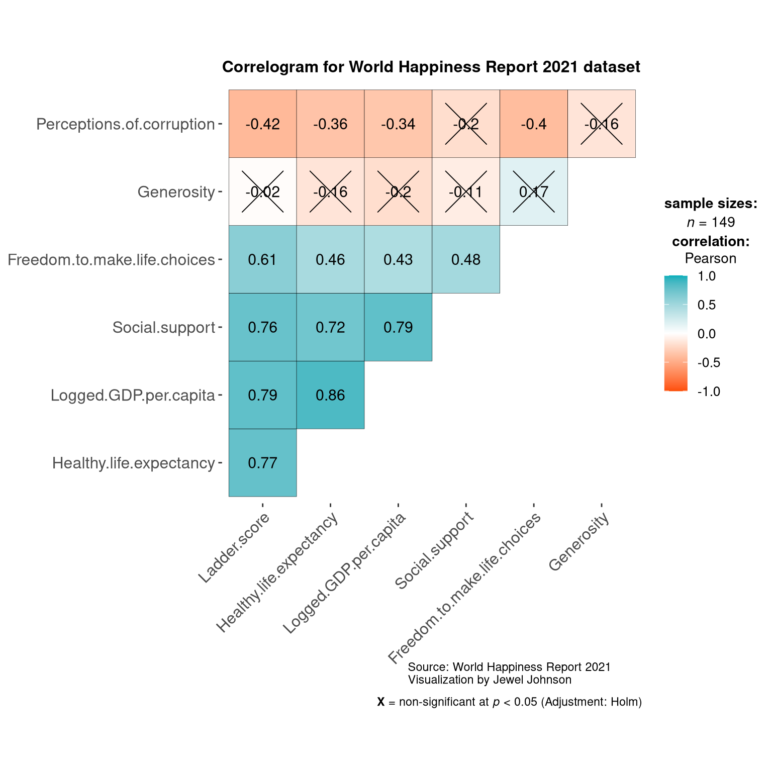
From the graph we can see that the happiness score is positively correlated against variables such as life expectancy, GDP per capita, social support and freedom to make life choices. Perceptions of corruptions is negatively correlated against happiness score which is expected. Surprisingly generosity variable does not seem to affect happiness score in countries.
Summary
I hope this post was helpful to you in understanding how to plot world maps in R. In short using {ggplot2} we have first plot a static world map using the data from The World Happiness Report 2021, then similarly using the {leaflet} and {sf} packages we plotted an interactive world map. Finally we plotted a correlogram using the {ggstatsplot} package to see which variables are correlated to happiness score.
References
H. Wickham. ggplot2: Elegant Graphics for Data Analysis. Springer-Verlag New York, 2016.
Joe Cheng, Bhaskar Karambelkar and Yihui Xie (2021). leaflet: Create Interactive Web Maps with the JavaScript ‘Leaflet’ Library. R package version 2.0.4.1. https://CRAN.R-project.org/package=leaflet
Pebesma, E., 2018. Simple Features for R: Standardized Support for Spatial Vector Data. The R Journal 10 (1), 439-446, https://doi.org/10.32614/RJ-2018-009
Patil, I. (2021). Visualizations with statistical details: The ‘ggstatsplot’ approach. Journal of Open Source Software, 6(61), 3167, doi:10.21105/joss.03167
Tutorial on plotting interactive maps in R.
Source for
.csvfile of World Happiness Score of countries 2021. Compiled by Ajaypal Singh in Kaggle.com.
Last updated on
[1] "2022-01-20 10:20:45 IST"